Friday, April 20, 2012

Boneyard Arts Festival display!!!

I'm in the middle of a totally insane period right now, involving my own final papers/projects as well as helping herd my chimpanzees toward their own final exam and term paper assignment, so I don't have much time to post, but I thought I'd mention this:

My first ever art display is currently up at the Museum of the Grand Prairie, and will be there through the weekend.  I will be at the Museum for their Boneyard Arts Festival event on Sunday, 4/22, from 1-5PM.  (I may not be able to make it to the first hour or so, as I'll hopefully be out buying a house.)  I have three painted/mixed-media pieces, and one drawing, as well as a handful of necklaces and earrings and a binder with photos of some of my digital work.  Go check it out if you're in the neighborhood!

I'll probably make another post after the show to talk about how it went, things I learned, etc.  Though it may have to wait until finals are over.

Saturday, January 14, 2012

2012: Year of the Commission

In 2011, I did three commissions. In the whole year. In the first two weeks of 2012, I've done four. I get the feeling this year is going to have quite a bit more steam.
(Forgive me, these aren't all Celtic work. I take the commissions as they come.)

This first thing was a character sketch commission that a friend asked me to do for another friend of his as a gift. The guy's Witchblade character. A paladin for a something-or-other god.
This second is a tattoo design for an old high school teacher of mine, combining three of his things: Metallica, WWII, and Batman. (My high school teacher is a dork, but a very cool one.)
This was a bookmark that a friend from college wanted to give as a gift to her boyfriend, another old friend. The Ogham writing in the middle reads "DRH" for David's initials. He actually requested the bookmark, which is pretty exciting. I've never had that happen before. It's acrylics and metallic acrylics on parchment, and laminated.
And finally, a revision of the personal logo for Jared (aka "Sablehawk") including the shield with the tree that he's using for his website. My impression is that he'll be using this as his avatar on a gaming site he's setting up.

Friday, January 6, 2012

Metallic Acrylic Psychotic

Over the course of the past few days, I've been working like a fiend to complete this piece:
It was a lot of work. 
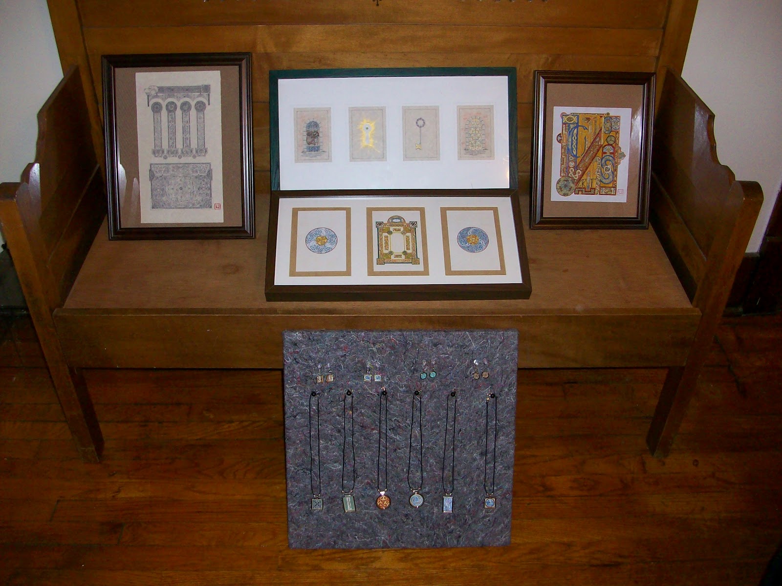
A lot of work. The tools included three synthetic sable brushes of varying size and shape, though all tiny; a set of 12 regular acrylics; a set of 6 metallic acrylics; and finally, an ink design on standard sketchbook paper from about 9 months ago. Not a complicated set of tools, but a big job nonetheless. The design measures about 5.5"x8.5".
It went pretty well, over all. At the end of the process, my hand still isn't as steady as I'd like it to be, but it's much steadier than it was, and I've come to understand better how the bristles on my brushes react to pressure, movement, wet paint, drying paint, etc.
I learned some very useful lessons from this process. Probably the most important was to keep a clean brush, and always keep an eye out for the paint drying on the palette (in my case a piece of cardboard covered in packaging tape). When the paint gets dry enough, it starts clumping - it will still transfer from the brush to the page, but not when or how you want it to. In short, it becomes exceptionally difficult to control. Since acrylic dries so fast, using just a little at a time on the palette seem to be the best way to go.
Also very useful to note, in regards to this style of work: in the design phase, do not make lines, make cells. A line is just what is sounds like: a segment of solid-color ink. Lines are problematic, because it's difficult to paint over them (while maintaining the line) and it's more work to paint around them. A "cell" is better. A cell is a space with lines on either side that you can fill with color(s). Since I'm not used to painting, this has never been an issue, but I will need to get in the habit of doing cells rather than lines from now on. (You can see in the image below where I ran into this problem in the "S".)
Another beginner lesson that I learned the hard way: just because red goes with yellow, and yellow goes with blue, and white goes with anything, doesn't mean all these things should be combined in the same painting. It all looks pretty good, but I do wish I'd used less white, and I feel like the red and the blue are competing for space, when originally it was supposed to be all red and yellow with some blue bars for a kind of color-kick.
This was a maddening piece to do. It involved an incredible amount of patience, a virtue of which I've never possessed much. Toward the end, I was really starting to lose it.
However, it gave me an interesting perspective on the insular manuscripts that were the inspiration for this piece. The Christian monks who produced the Celtic insular manuscripts believed that the written word was the highest form of prayer, since every word written on the page was the direct word of God. They believed that because written words (and their accompanying illuminations) were the most holy of relics, the holiest act for a scribe would be to fit as much writing and illumination on each page as possible.
Whole monasteries would work together to produce the amazing manuscripts we know today, devoting year after long year to creating these incredibly complicated and beautiful pieces of art. When I was working on this piece, sequestered as I was in my office, I started trying to put myself in the mindset of these 7th-9th century monk-scribes, and there are some remarkable parallels between doing this kind of art and living the "good" Christian life. For each, the actor has to be extremely careful, move slowly and have patience, lest a hasty mistake is made. It's certainly possible for one to speed up, to take more risks, and maybe it will still turn out fine in the end, but each tiny mistake - insignificant though it may seem by itself - detracts from the delicate interconnection and beauty of the finished work.
Also interestingly, from my more agnostic and social scientific perspective, it's a great illustration for how I see religion in general - creating something incredibly complicated in service of a silent and unknown deity while latently stumbling onto some fundamentally secular truths about how to live life is a pretty appropriate metaphor.

Now that's all done. On to the next monster.

Friday, December 30, 2011

Swaggitude

The holiday season, for me, extends more or less from my birthday on October 30 through Christmas and its surrounding celebrations. This year, considering my constant focus on improving my art, people were not at a loss for what to get me. (Nor was I at a loss to get myself. I bought a few of these things, much to the chagrin of people shopping for me.)
My art supplies:

Additions to my collection include:
-3 new Bristol pads of varying size
-A big sheet of parchment
-A pound of scrap vellum (goat, sheep, deer, and calf, for comparison)
-A book on the Book of Kells, a book on the Lindisfarne Gospels, and a Celtic art instructional book
-Five tiny little synthetic sable brushes with differently shaped tips
-An imitation gold leaf starter kit
-A gold leaf kit
-Wood carving tools (chisels, sanding sponges)
-Jewelry-making tools (bezels, epoxy, exacto-knife, a smoother/flattener thing, tape for laminating)
-Metallic paints in a variety of colors
-Refillable calligraphy brush
-calligraphy quill pen set
-Extra ink refills for my technical pen

I've gotten so much swag this year, I feel compelled to find a big pirate treasure-chest to keep it in. Maybe I'll ask for that next year. Thank you Mom, Katie, Caitlin, Cheryl, Joe, Jake, Marcess, and Self. Your contributions will not be wasted.

Wednesday, December 28, 2011

Songs of the Hunt (line-art)

I've been away from the blog for a while, and this is why. About a month ago, I drew the following template/outline:

I wanted to start putting together an insular-style piece using the kind of columnar layout that can be found in the Book of Kells, the Lindisfarne Gospels, and a few other insular manuscripts. I like the look of that layout, and though I still don't know what the words will be, I've thought that it's a really nice design for framing a small amount of text in a larger illumination.

So, school ended and I went to work.

As is my habit, I went through my process of filling in each space, first designing and redesigning the animal-patterns that were to form the bulk of the image with a pencil, and then going over the final pencil designs with a technical pen (my wonderful Signo bit 0.18).

In the columns, and the circles above, you can see dogs and birds, as well as traditional Celtic spiral patters and basic interlace. The people at the bottom, with their flutes and their books, represent the scribes and bards relating the glory, the madness, and the humor of the hunt, with the spirals representing their music and the clearer images of the dogs and birds representing the tales. I don't usually go for themes or particular motifs in my work, but when you're doing traditional Celtic illumination, dogs, birds, and people tend to be most of what you have to work with and the theme kind of emerges on its own.
At the top, you can see more animal patterns (including the big oafish head of my own St. Bernard, Darwin). Also, at the bottom of the image above, you can see in the little circles a different kind of Celtic patterning called "steps," which were common in insular art, though completely new to me. Actually, along the sides of the outer columns, I used a so-called "fret" pattern, which is also traditional, but a novel thing in my art. I was full of experimentation with this thing.
The chest (so-called because I think it looks like a big traveling case) at the bottom of the design was...mixed. I wasn't terribly happy with how the three sections at the top came out, but the derivations from the Lindisfarne Gospels on the left and right came out really well, and the circular area in the middle is something I'm really pretty pleased about, mostly because it's simultaneously very different and also very me.
So the line-work is finished. All in all, I have no idea how many hours it took me. Not more than 70, but not less than 50, I should think. And it's not over yet. Once I feel ready, this will be painted, which will take...god, I don't even want to think about how long. A long time. But if it goes well, it'll be worth it.
Here's a scanned copy of the design, with much higher resolution. If you do a right-click and say "View image," you should get a (very) large view of the line-work, which makes it a bit easier to see the details.

(p.s., Because I have no life and am a dork, I counted: including the 6 humans, this thing contains 169 animals. Pretty remarkable when you consider that the whole thing is 5.5"x10.5")

More jewelry practice

Greetings, subjects of Earth. I've returned from my working hiatus, and have more goodies to post.
I've been practicing with the jewelry equipment my sister bought me, and I've actually put together a couple of new pieces that I've been pleased with. The first is a pendant for my lovely wife, Caitlin, complete with her first initial and some Gerber Daisies (which she quite enjoys):
My inspiration for this piece came from this amazing tutorial: Illuminated 'P' by ~somk. Obviously I've got a lot of work to do before I can produce work of that quality, but I've taken a few baby-steps on that road, beginning with buying myself a wonderful set of tiny itty-bitty brushes, and receiving a bunch of varied Celtic art supplies for Christmas (which I'll probably be posting about on Friday).

The second and more recent attempt was this pair of earrings for my sister, for Christmas and also to thank her for sending me down this jewelry-infested avenue:
They came out pretty well, I think. Quite simple, but pretty and very homemade gift-looking.

I've learned a couple of lessons from these projects that might be useful to any of you looking to try this at home:
1) Make sure to laminate both sides of your image, otherwise the epoxy seeps into the paper and dulls the colors.
2) If you mix the epoxy more slowly and gently, you end up with fewer bubbles and better visibility. As the inimitable Katie Cragoe put it, you're not making a souffle.
3) Make sure to mix the epoxy thoroughly. If it's not fully mixed, it won't dry all the way, and you'll have to apply another layer on top which takes an extra day of drying, and sometimes doesn't work if your bezel is already too full.

That's it on jewelry. More to come on the recent illumination project.

Thursday, December 15, 2011

I would walk 500 miles

Just, so you know I'm not completely slacking off, this is what's happening around here:

Yeah...I'm not a prolific artist, but it's not for lack of trying. It just takes me forever and ever to finish these bigger pieces.

Friday, December 9, 2011

Thor Mjollnir Tattoo design

Hooray for finals being (almost) over! It's pretty satisfying to be back in the saddle. I'm still working on the other illumination piece, but that's going to take me forever and ever, so I figured I'd so something a little simpler in the meantime.

I'm calling it "Thor: Norse God of Looking Sinister and Pissed."

Thursday, December 8, 2011

A Pendant!

So, in the weeks preceding this blog's birth, I'd been trying to figure out how to move toward professionalization in my art. My sister, a professional artist in the making, gave me some good advice. Art on paper is not hard to find, and especially with design-work like mine, people are much more interested in art on things - carving, sculpture, etc.
So for my birthday, she made me a jewelry kit. It contained all the basic tools I'd need to start putting my art into pendants and earrings. I was crazy busy in the weeks following my birthday, but finals are almost over, and having a bit more time on my hands, I finally got around to trying out my kit.

Step 1: draw the thing.
Step 2: Color the thing, and laminate it with clear packaging tape.
Step 3-5ish: Assemble the tools. Cut the thing out to the proper size. Mix the epoxy in a disposable container, and put a little epoxy into the bezel, followed by the thing, followed by more epoxy.
Step 6: Let it sit for at least 12 hours, probably longer. Don't touch it. My sister was adamant about this.
Step 7: Appreciate the thing you made. Except...I think I did something wrong with the epoxy, because it came out all bubbly, and you can't really see the design from more than a foot away. Oh well. Live and learn.

Sunday, December 4, 2011

Busy time

Hey, Internetites. I'm sorry to say, I don't have any art to post today. I'm in the midst of finals, and haven't picked up a pen in days.
I did want to point out a couple of cool things, though:

1) In order for a piece of art to be properly called an "illumination," it must be painted at least partially with actual gold. I've gotta learn how to use gold leaf...
2) The monks who painted the old Celtic manuscripts actually put together the pages based on a process that is surprisingly similar to my own, using almost the same tools. (Except for photoshop, obviously.) They started with empty vellum, which they punctured to create the borders and general shape of the designs. This was followed by pencil (sort of) sketches of a grid on the vellum, so that the designs could be created symmetrically and carefully in terms of space distribution. Then they did the designs in pencil, painted over them with small pens made from feathers or reeds and dyes from tree bark, minerals, berries, etc., and then applied the gold overlay to the important bits. Most importantly for me: none of this is prohibitively difficult, or lost to antiquity. I could do this, today.
3) All the animals in the Celtic manuscripts are drawing with big, circular eyes, so they all look constantly surprised.

I'll try to get back on the ball soon. Final paper and exam happening on Tuesday, and then my schedule is (slightly) more my own again.